
r/place Analysis
2022
TL;DR
r/place was a giant shared canvas on Reddit where millions of people placed one colored pixel at a time, with no one in charge, constantly painting over each other. I took the full history of every pixel placement and ran it through Python to pull structure out of the chaos.
The thing that worked best: if you average the canvas over time, the constant vandalism smooths away and the picture people were trying to make comes back. My version of the Canadian flag doing this hit 45,000+ upvotes on Reddit.
The data
Every entry in the dataset is one pixel placement: where it went (x, y), what color, and when. Simple enough on its own. The catch is that there are a lot of them and a single pixel might get painted over hundreds of times. So before any analysis, I had to reconstruct what the whole canvas looked like at any given moment, and track how each pixel changed across the entire event. Getting that to run without choking on the size was most of the upfront work.
Pixels nobody ever touched
The first thing I looked for was pixels that never changed once, start to finish. Out of the entire canvas, only 3,966 stayed completely untouched.
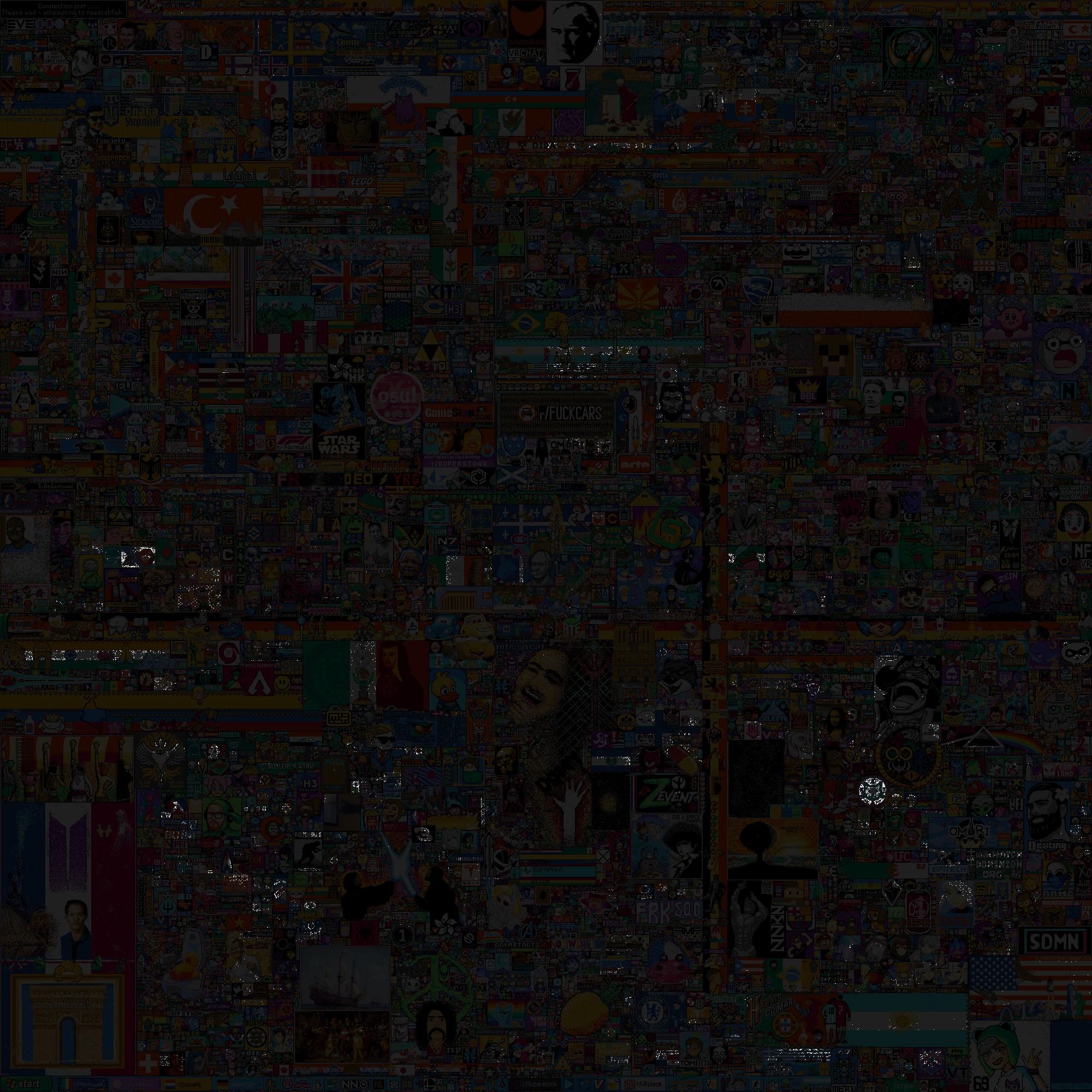
They mostly show up in two kinds of places: spots people coordinated hard to protect, and out-of-the-way corners nobody cared enough to mess with. Those two categories look identical in the data and I have no way to tell them apart automatically, which bothers me slightly.
Hidden crewmates
If you color the canvas by how often each pixel changed instead of by its final color, things appear that you’d never catch while it was live.
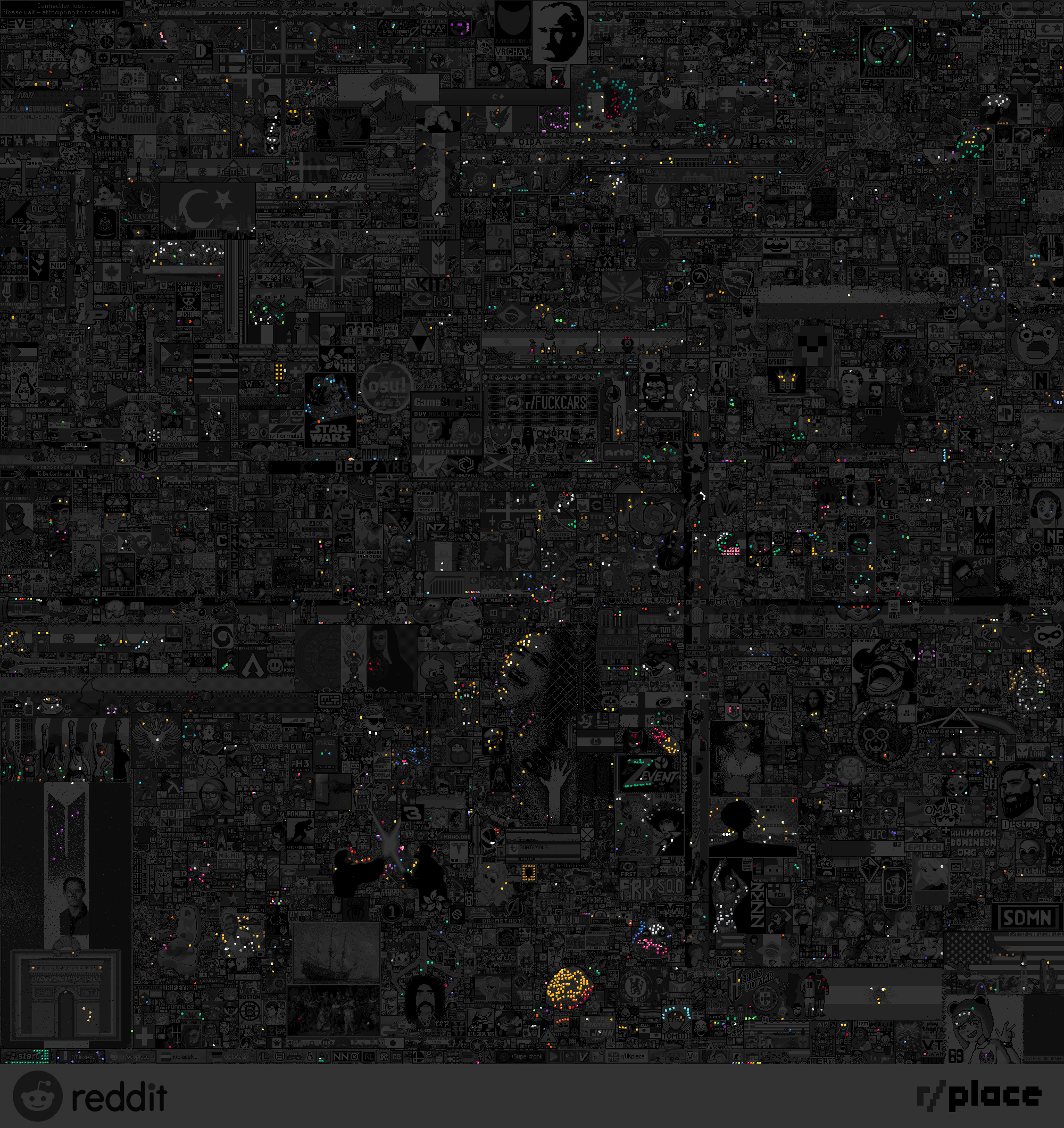
All over the place there are little figures tucked into low-traffic regions, the standout being a bunch of hidden Among Us crewmates. People kept them alive with slow, coordinated edits in areas nobody was fighting over, so they stayed invisible until you look at the canvas this way.
Heatmap and the rest of the stats
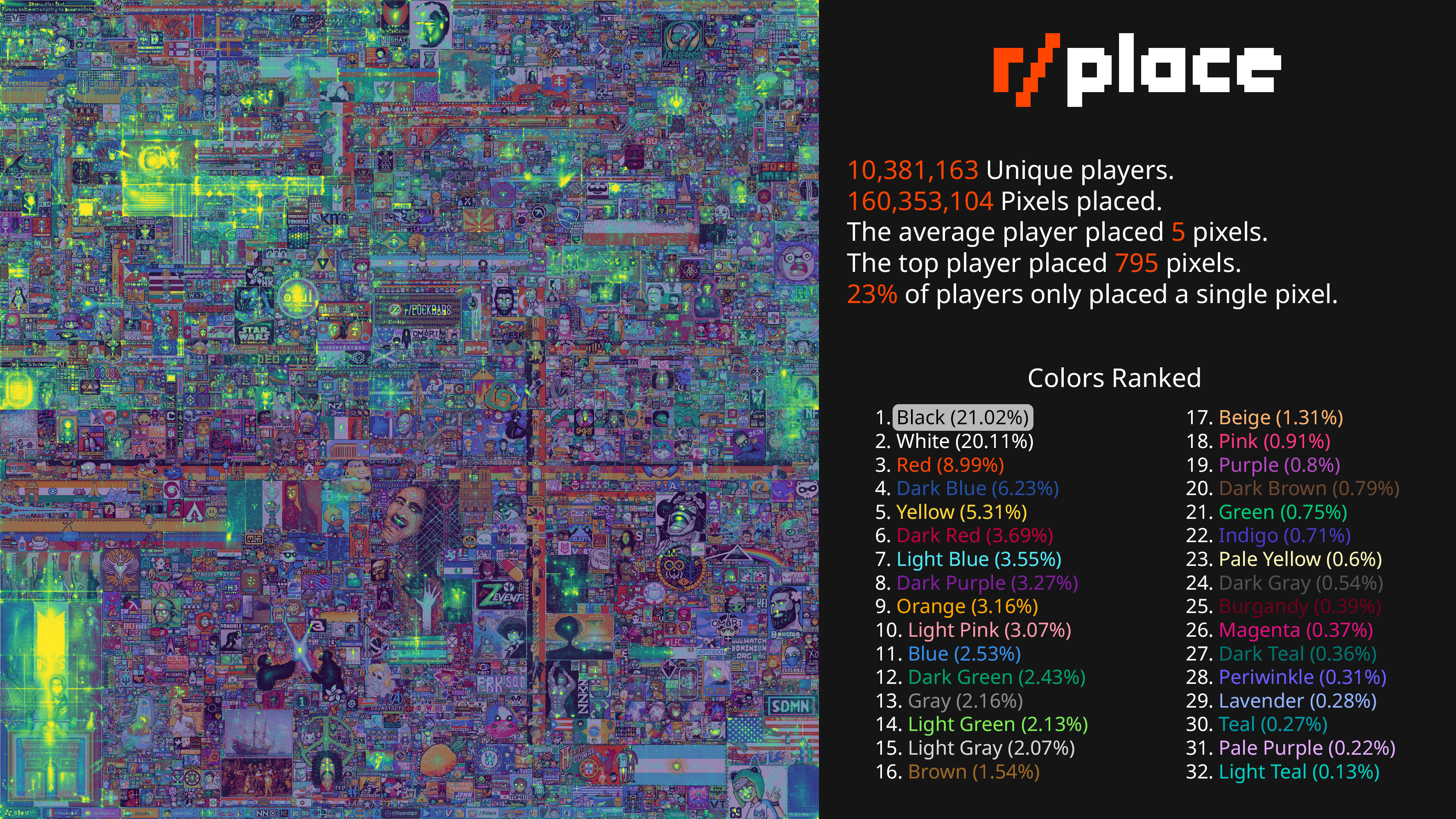
I also generated a heatmap of where most of the edits occurred. Here’s that, plus some more statistics:
The Canadian flag
The clearest example of averaging paying off is the Canadian flag:
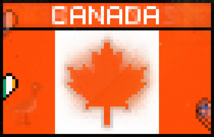
Live, that area was a constant mess of edits and people trying to deface it. Averaged over time, the flag people were defending snaps into focus and the vandalism washes out. I posted this one and it took off, over 45,000 upvotes.
No model, no clever technique. Counting how often pixels change and averaging them over time, run carefully over a dataset big enough that you have to think about how you touch it. That was enough to surface the pixels that never moved, the hidden figures, and the images underneath the noise.